Fashion
Colour and Confidence: Building a Signature Palette
The most enduring style signatures are built on a personal colour palette — a small set of shades that work together flawlessly, photograph beautifully, and feel unmistakably you.
Colour is the element of dress that most directly affects both mood and perception. Research from the Pantone Color Institute (pantone.com/articles) consistently shows that colour choices in clothing influence first impressions more powerfully than any other sartorial factor — and that they affect the wearer's own mood and self-perception significantly.
Building a signature colour palette means identifying the 4–6 colours that work harmoniously together, suit your skin tone, and align with your lifestyle. Once identified, these colours can be deployed across every category of clothing — from outerwear to accessories — creating a wardrobe in which everything works with everything else and getting dressed becomes effortless.
**Discovering your palette**: The most reliable method is the draping technique — holding different coloured fabrics against your face in natural light and noticing which make your skin appear luminous and your eyes vivid, and which make you look tired or washed out. Colour analysis services like Kettlewell Colours (kettlewell.co.uk) offer professional colour analysis consultations, both in-person and online.
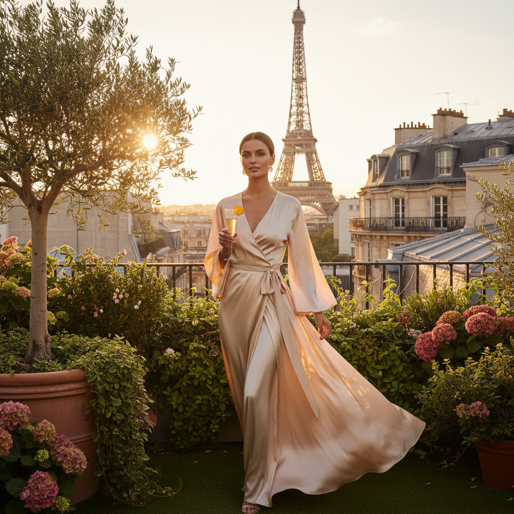
**The Mimosavated palette**: Our brand draws its visual identity from the mimosa's own colour palette — champagne, gold, warm ivory, blush, and the deep amber of a well-aged Champagne. These are also, not coincidentally, extraordinary colours to wear: universally flattering, highly photogenic, and possessed of a warmth and glow that colder palettes rarely achieve.
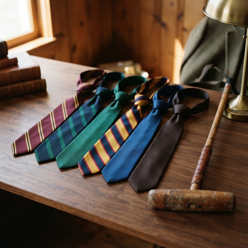
**Colour rules worth breaking**: The traditional warnings against wearing red and pink together, or navy and black, have been comprehensively retired by the most sophisticated contemporary dressers. Unexpected colour combinations — burgundy and terracotta, cobalt and emerald — are the mark of a confident, evolved aesthetic. The only colours that genuinely don't work together are those you haven't found the right context for yet.

Continue Reading